Valentine's Day Gift Guide

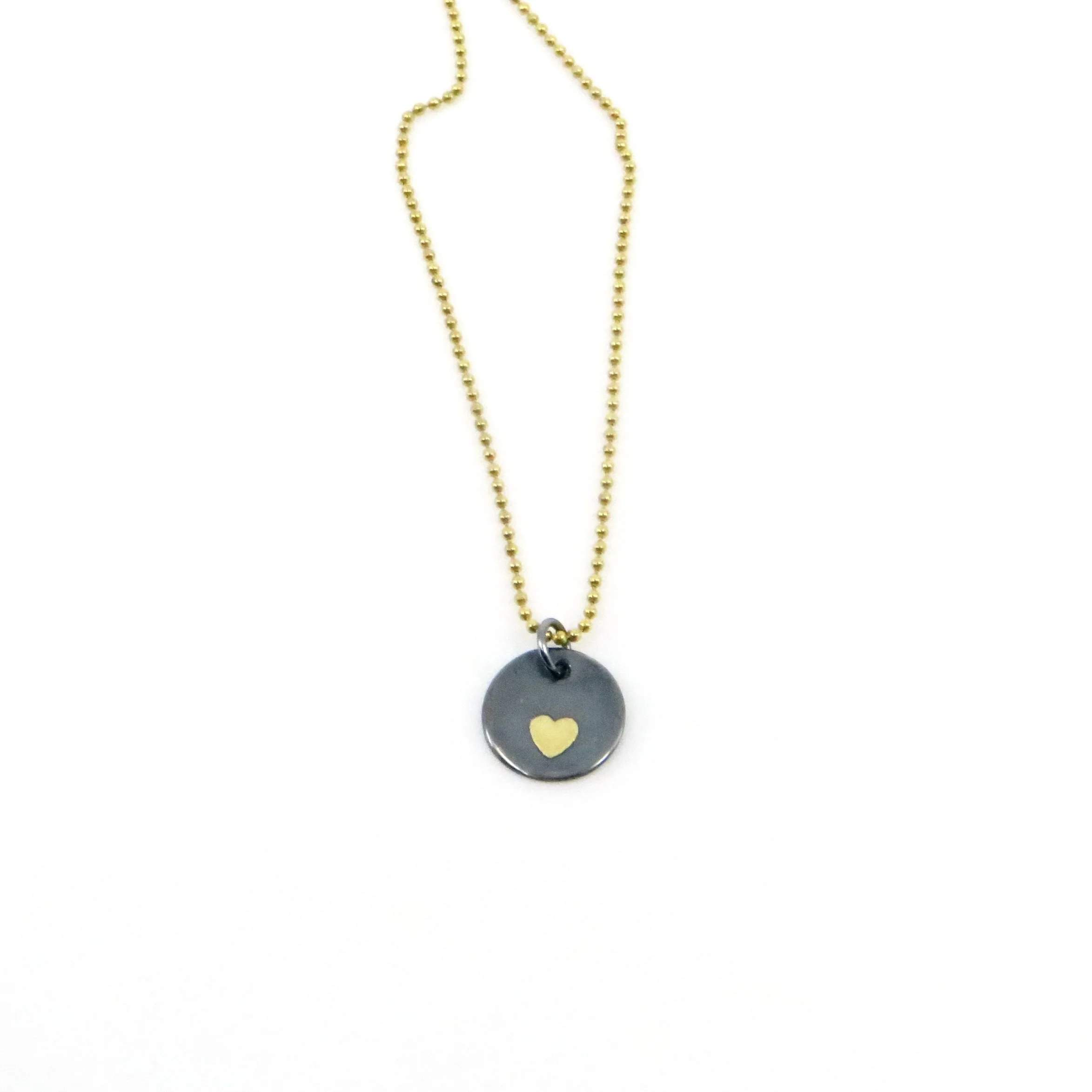
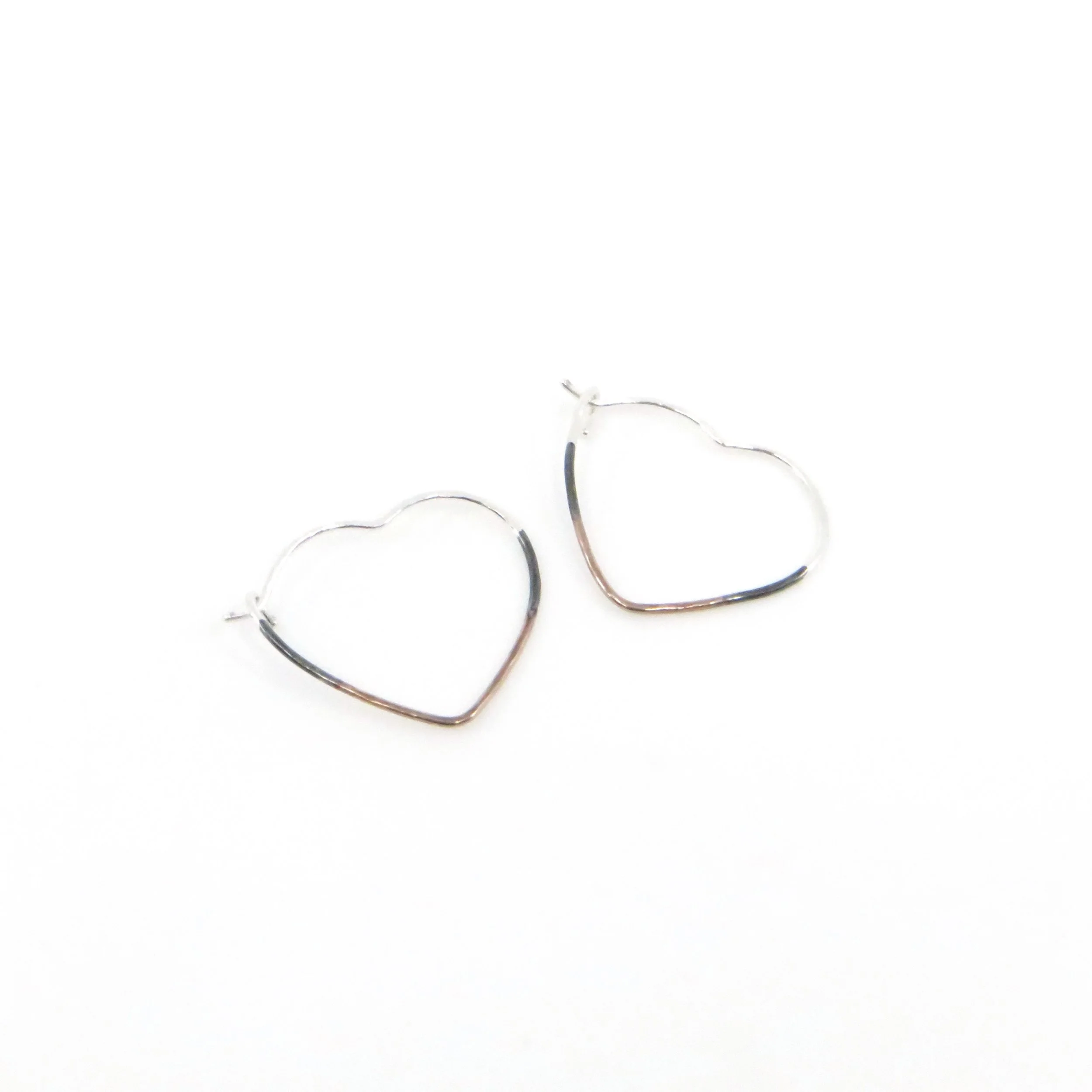
If you’re looking for something unique to give your loved ones this Valentine’s Day we’ve got the perfect thing, from traditional gifts like jewelry to something more quirky like a gyotaku octopus print. Browse our online gift guide below for some inspiration!


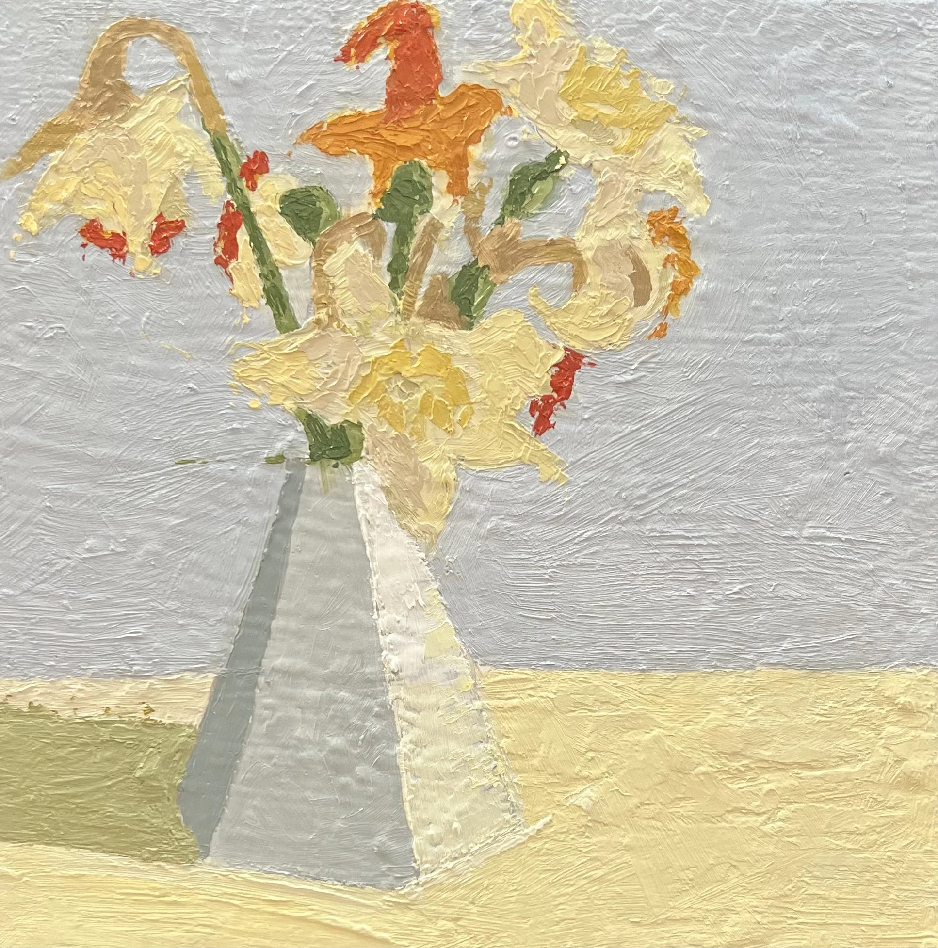
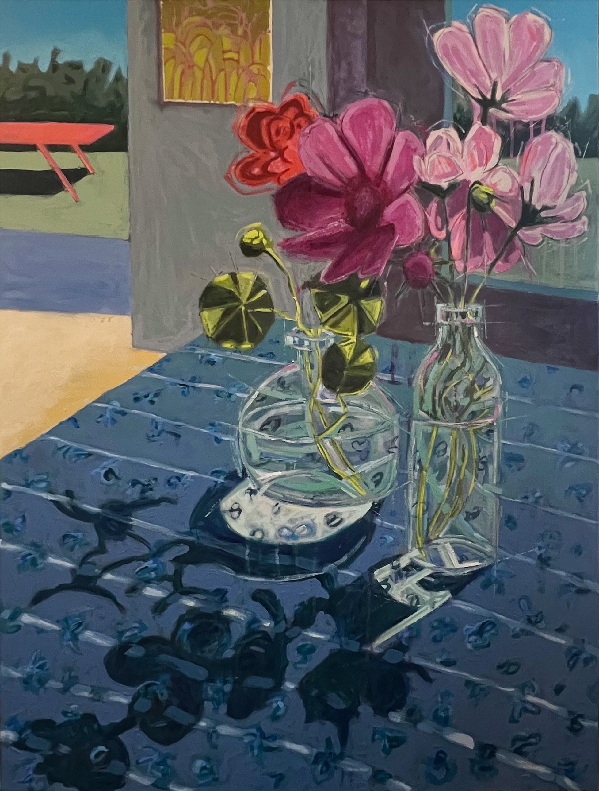
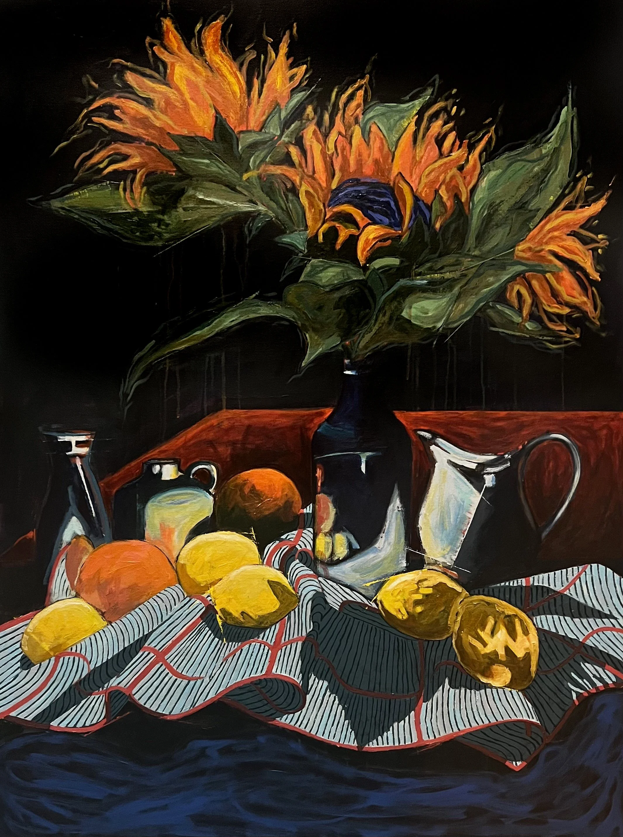
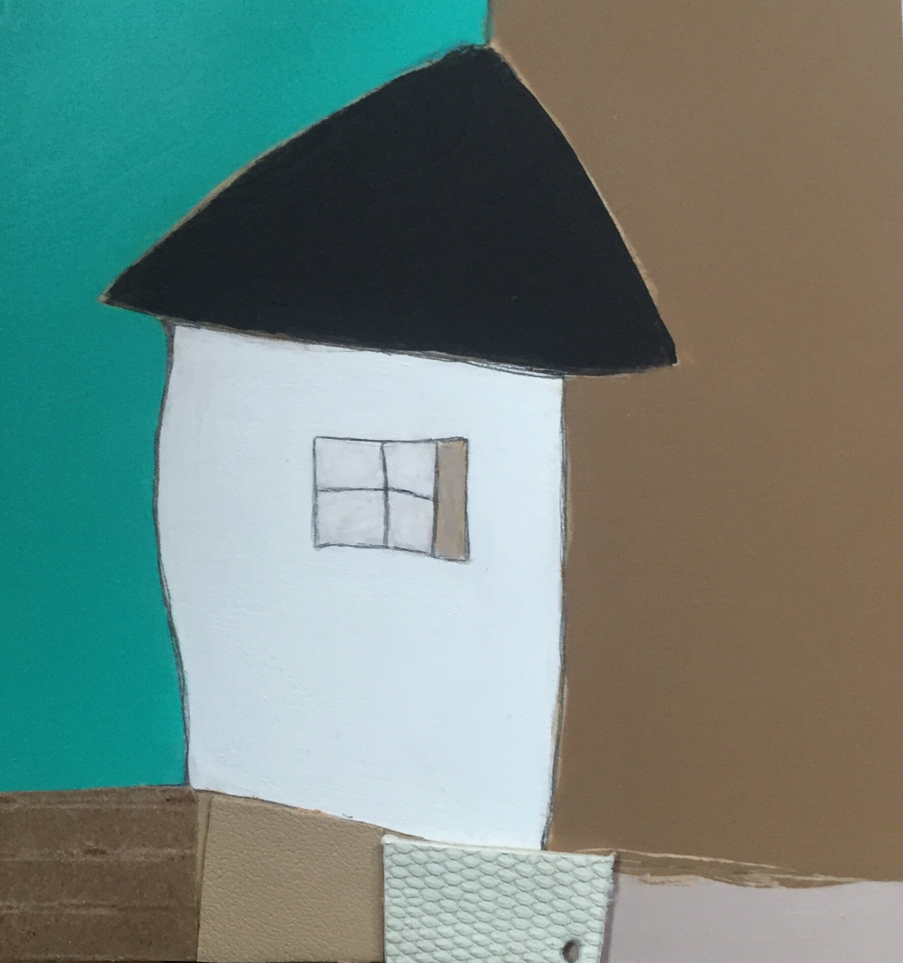
Painter Karla Quattrocchi uses bold blocks of color and unconventional materials to create her charming paintings.


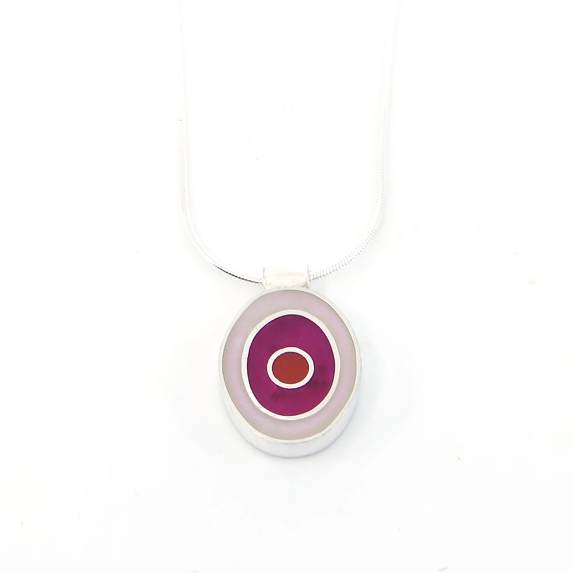
Maeve Mueller’s delicate porcelain jewelry can add a touch of glamour to any outfit.


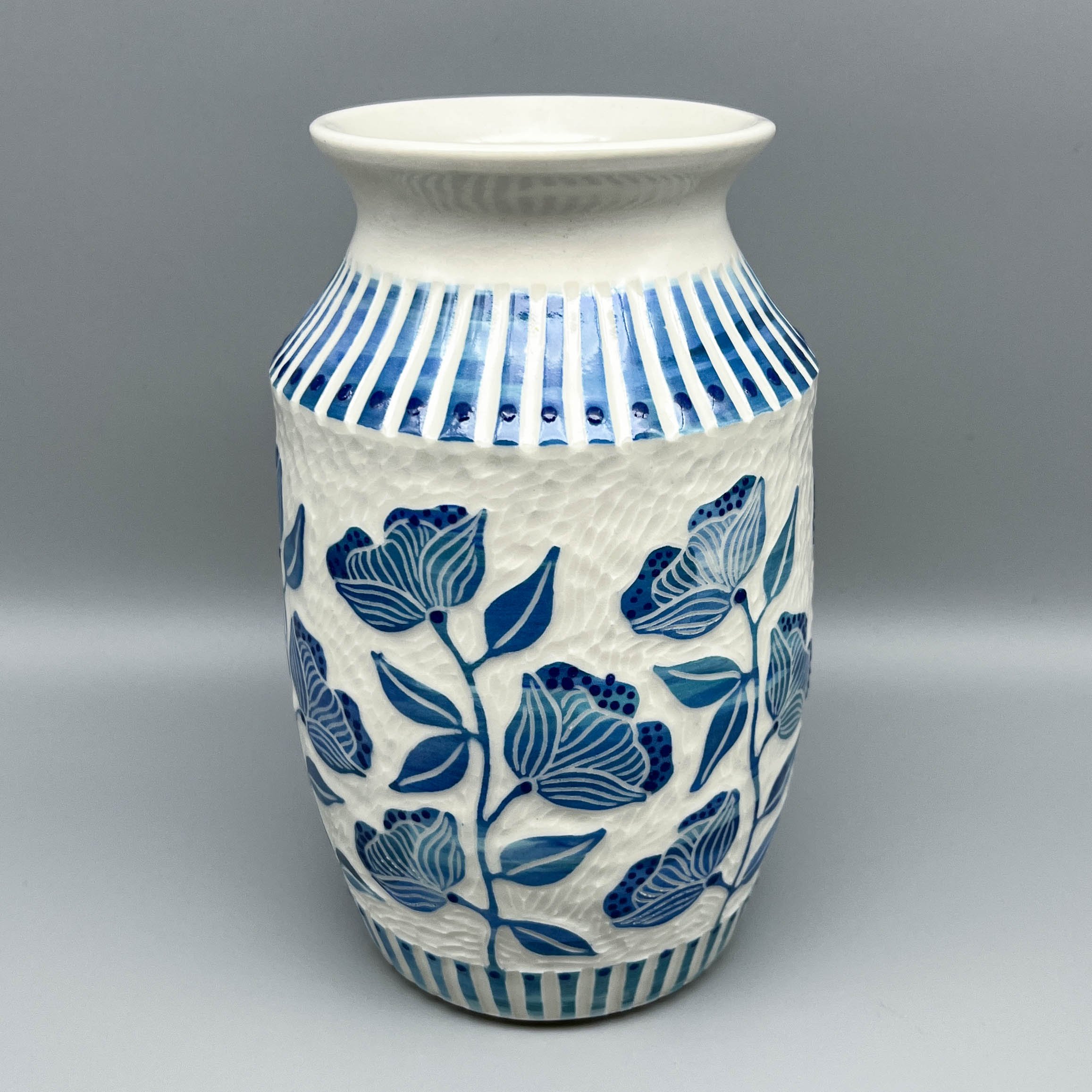
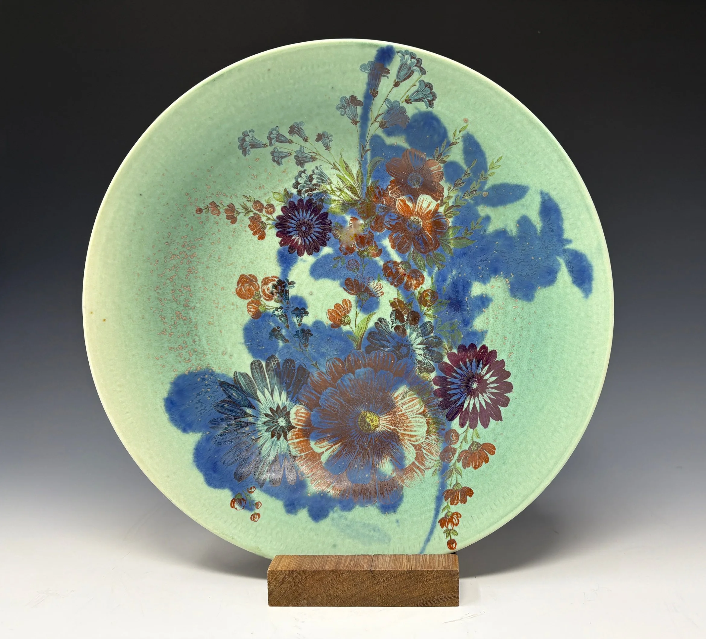
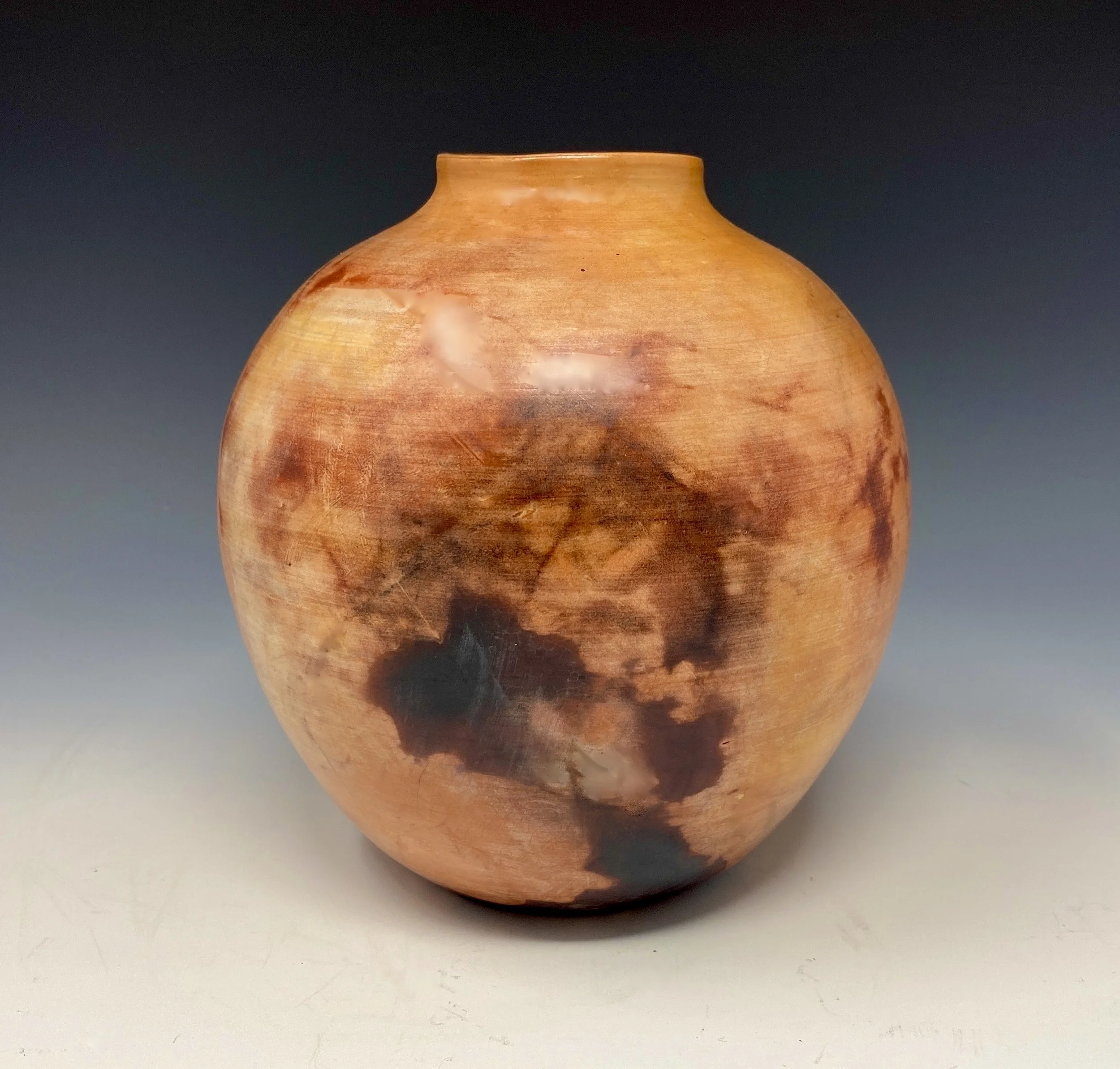
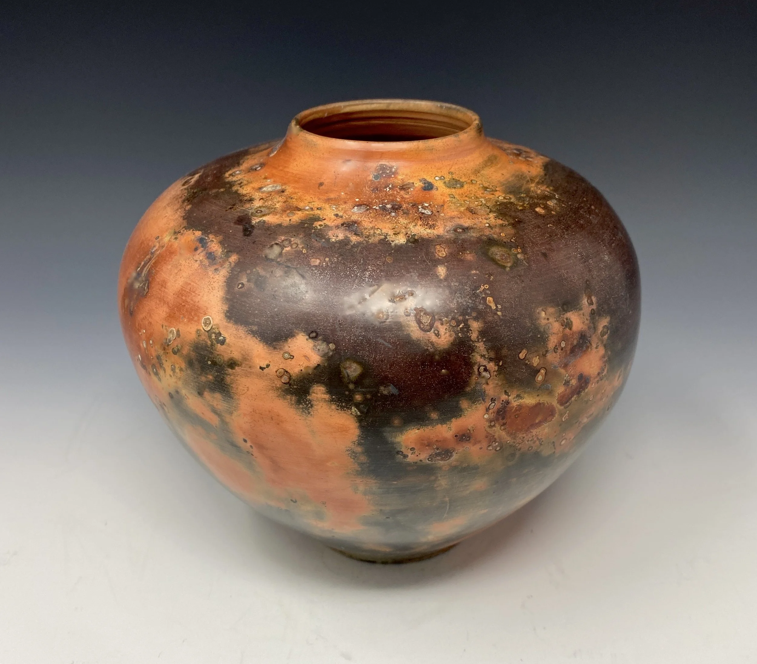
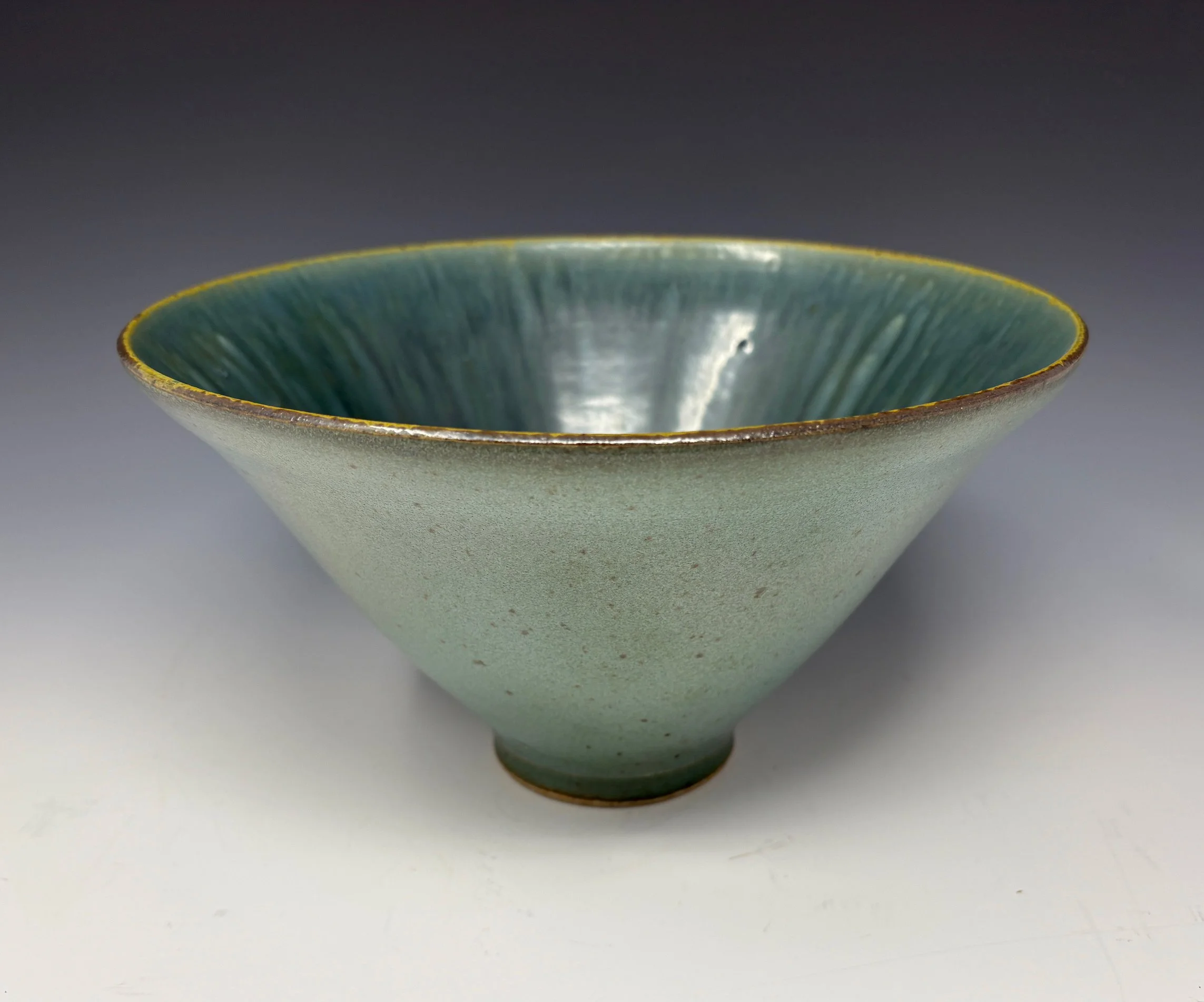
Beverly Carter uses a variety of decorative techniques, from screen printing to saggar firing, to create the beautiful designs on her ceramic vessels.


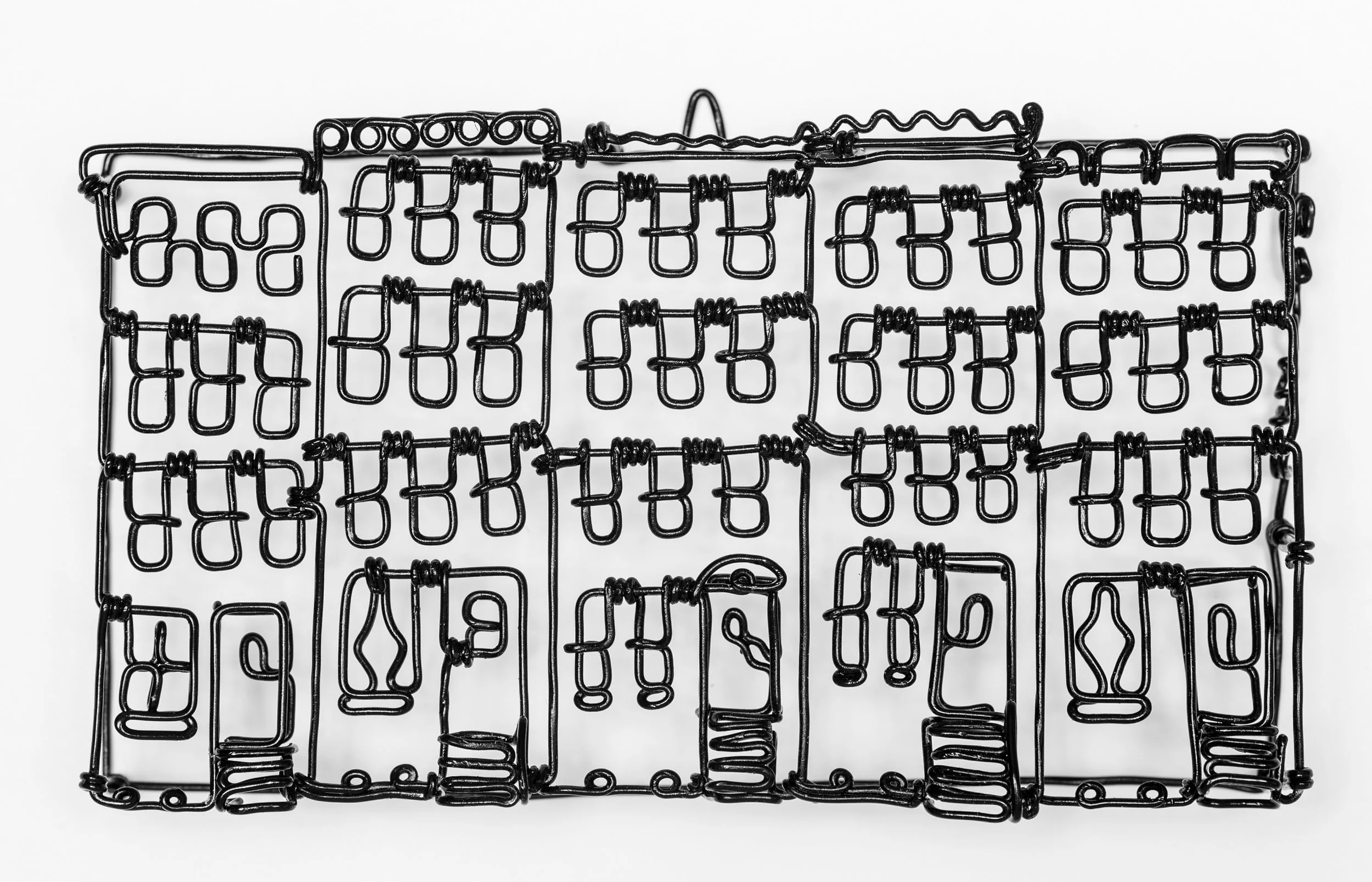
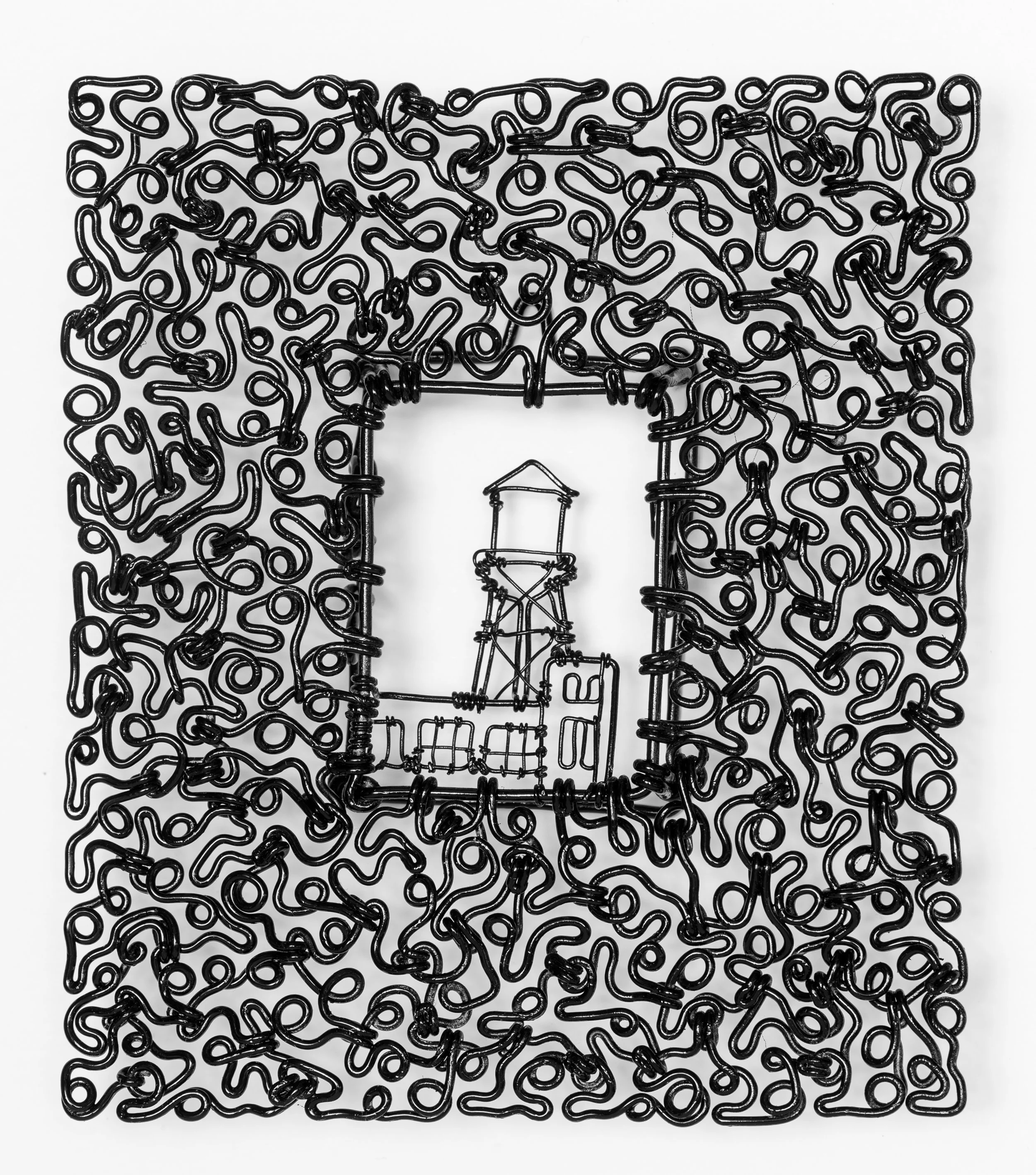
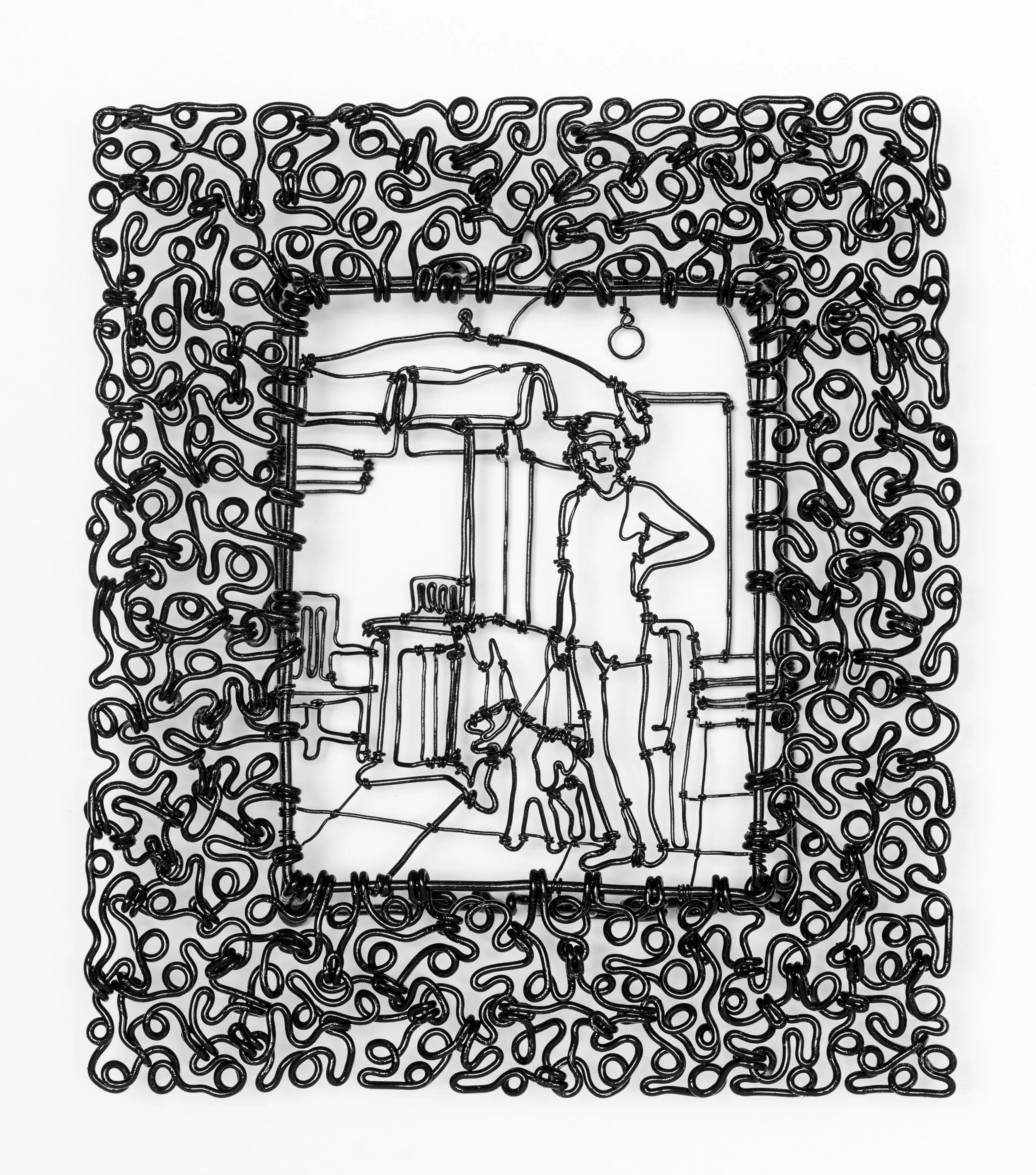
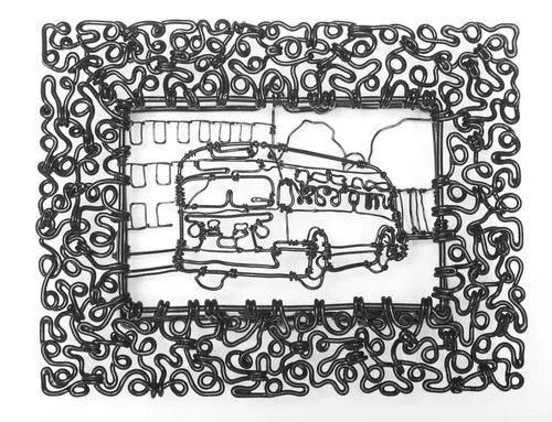
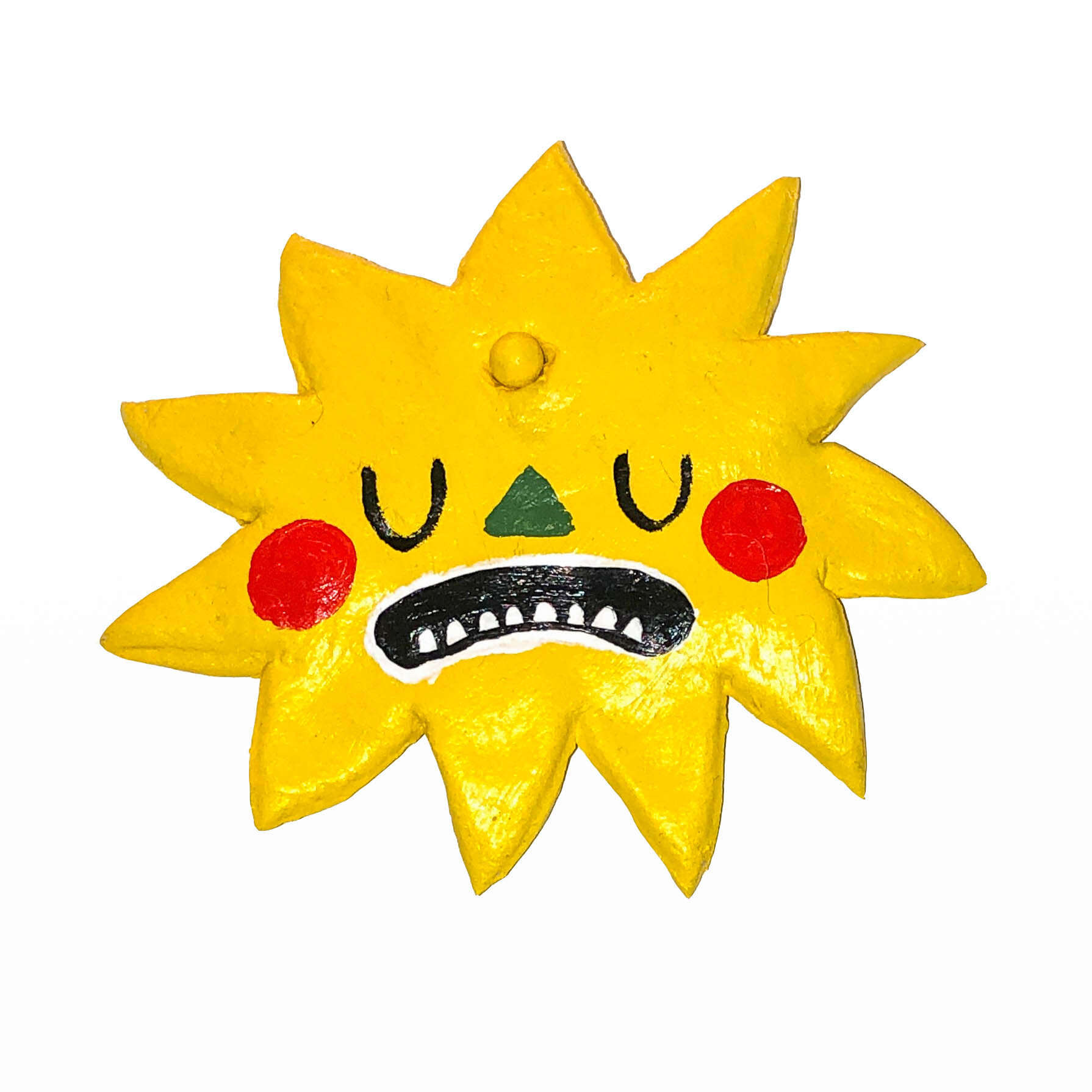
Caitlin Duennebier uses humor to infuse every one of her sculptures with a compelling personality.


Gyotaku is the traditional Japanese printmaking technique that Stephanie Mason uses to create her delightful octopus prints.


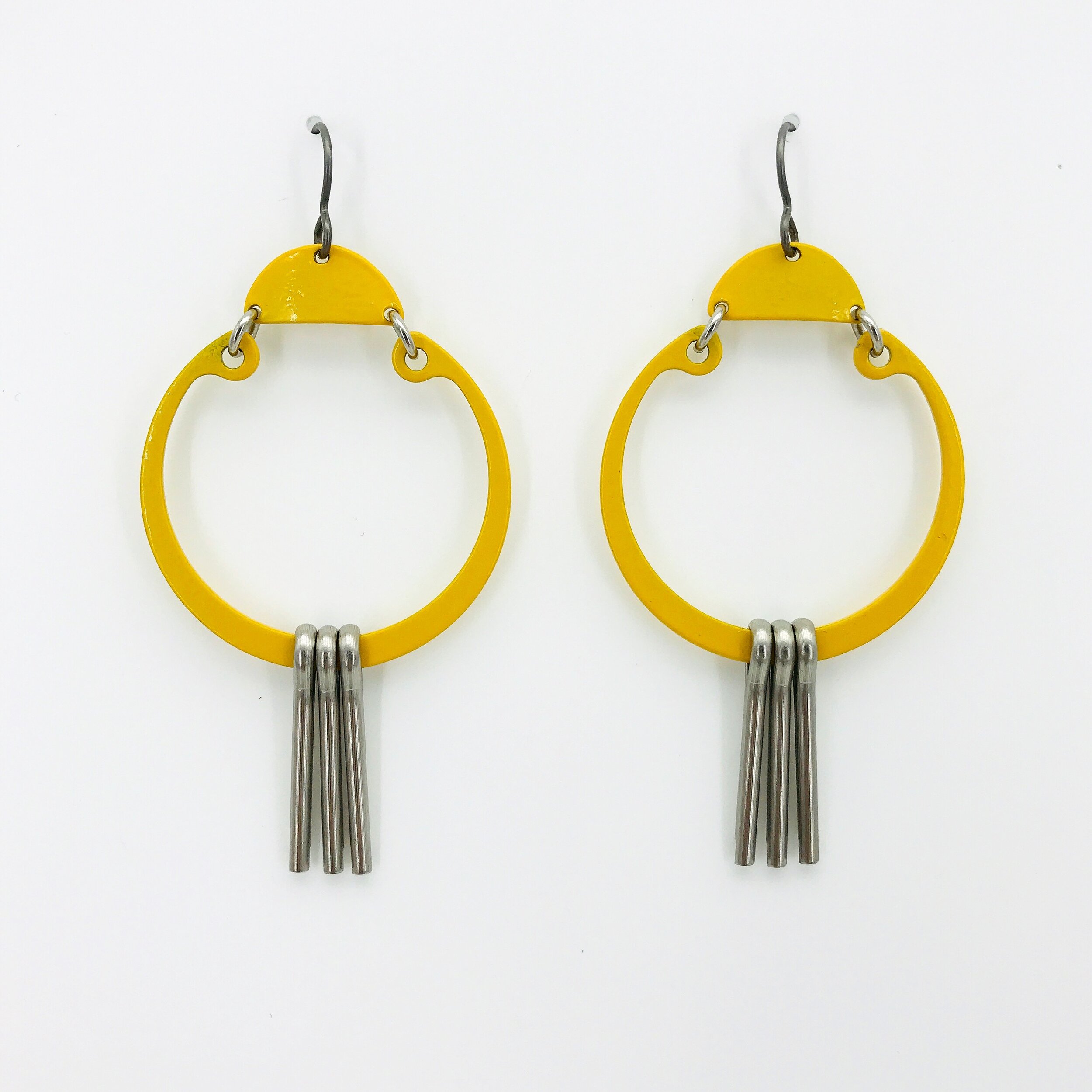
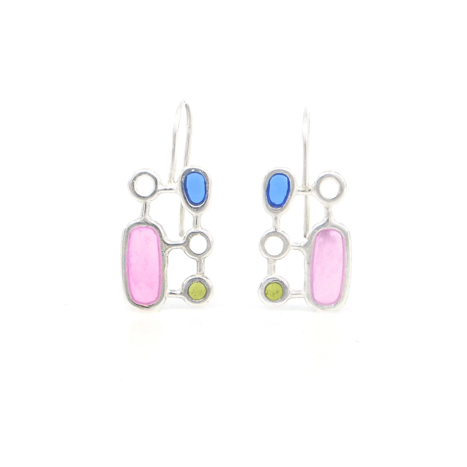
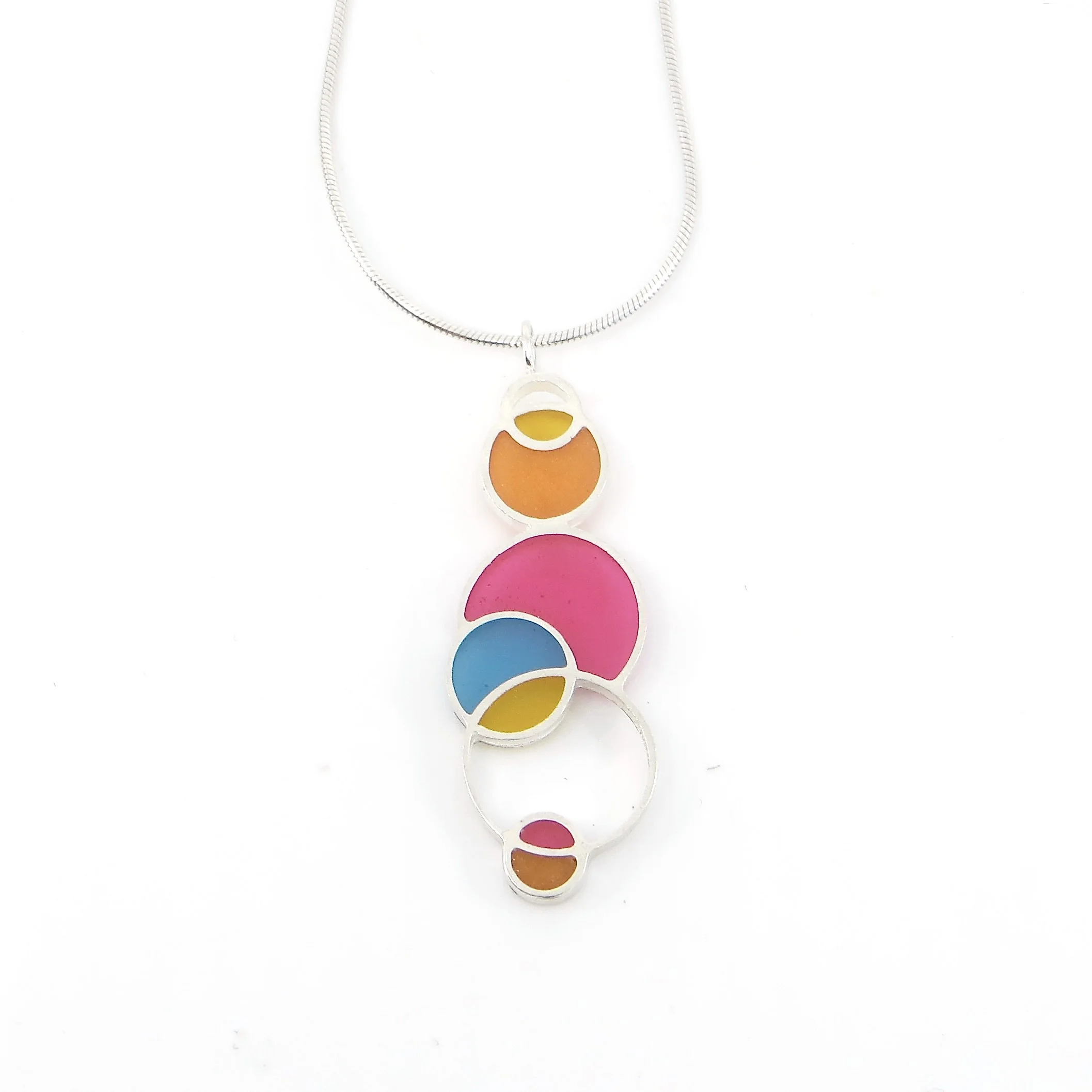
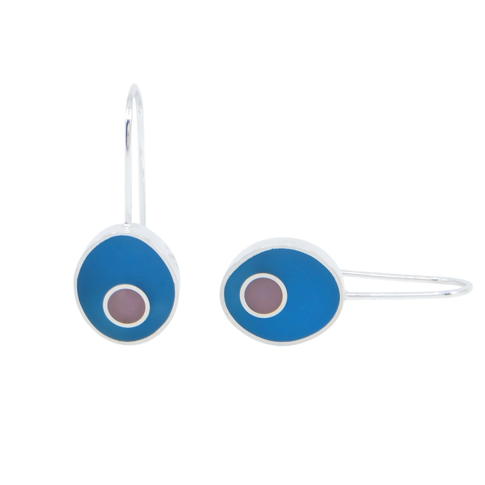
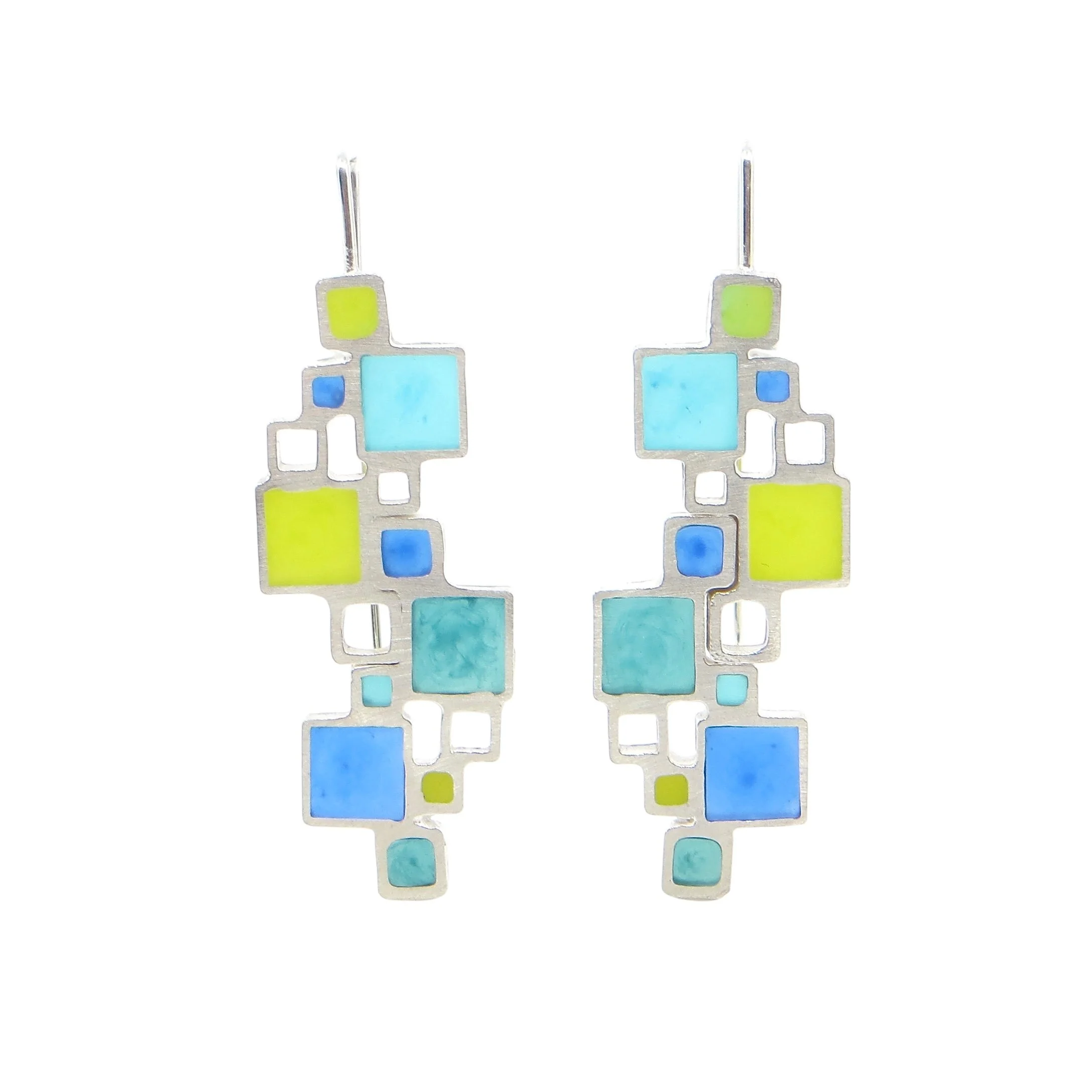
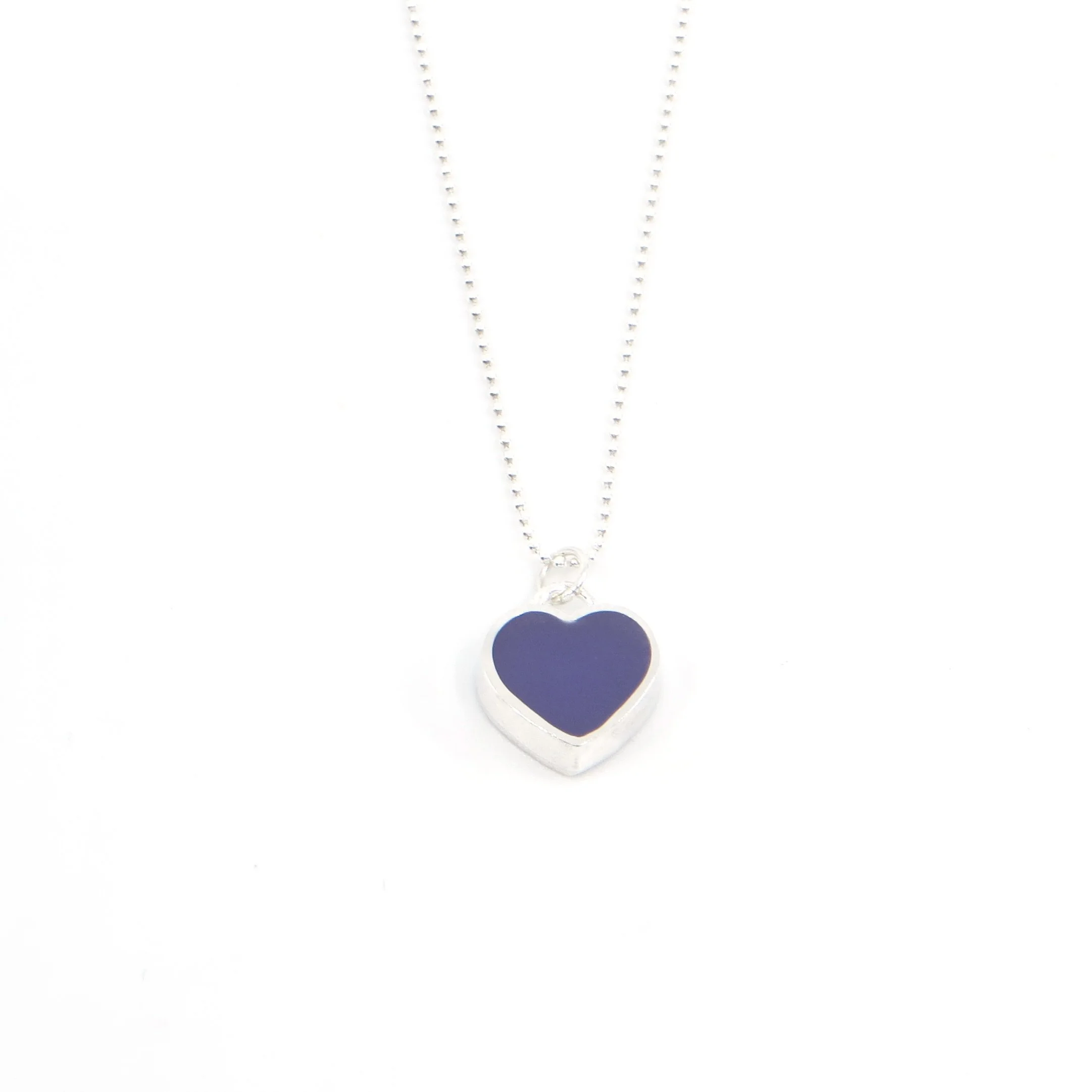
Wendy Jo New’s hand-crafted designs are perfect for anyone who loves whimsy and a pop of color.


A Cape Cod classic, Jobi Pottery’s colorful and functional pottery makes a great gift for everyone. We just returned from a quick trip down to Truro and came back with over 80 new pieces!


Transition of Power: 2021 - A Closer Look

On January 20, 2021, we were proud to commemorate the inauguration of President Biden with the opening of our current exhibition Transition of Power: 2021. At 13FOREST Gallery we consider it an important part of our practice to document artistic responses to the American political system, and have hosted a Transition of Power exhibition for each new president in the past thirteen years. For this exhibition, we put out an open call for artwork, and the artists featured in Transition of Power: 2021 portray a broad range of responses to the Trump administration, from humor and anger to hope for the future under our new President. You can read their statements about the work included in Transition of Power: 2021 below.


Scott Bakal, Dim Stars: Transition of Power, acrylic, graphite and ink on panel

Scott Bakal, Dim Stars: Transition of Power, acrylic, graphite and ink on panel

Scott Bakal

The United States has endured the last four years of a completely detached administration.

A little over twelve years ago, we saw the intersection of multiple issues that culminated in our current political situation, including the spread of misinformation by Fox News and social media and the rise of the Tea Party and its harmful ideology.

The country has turned to extremes and this election seems to have put conservatives and liberals on call that extremism needs to stop. Clearly, extremism in government and for that matter, in society, does not work. We have seen similar extremes play out in Russia, China, Cuba and other countries over the last century.

The last 12 years of extremism is too much to put into one painting to illustrate this potential turning point in America’s history. This painting is a simple statement of the potential successes we have in front of us coming out of the confusion and pollution of the fabric of our society that we have all endured.


Resa Blatman

I was inspired to make this painting during the ravaging Australian wildfires in 2020, and while my own emotions were in turmoil over the steady dismantling of our democracy. The last four years have weighed heavily on me and my community of friends and loved ones, and I am grateful for the transition of power on January 20th. However, as I write this, there are still many political unknowns and fears. Nevertheless, I remain hopeful for a renewed America that embraces its vast differences and beauty, and the capacity to save its democracy. Blaze reveals the paradox of an unfolding environmental and societal tragedy mixed with an underlying allure because beauty and regeneration reside even in the darkest expressions of humanity and nature.

Resa Blatman, Blaze, oil, acrylic and colored pencil on Mylar

Resa Blatman, Blaze, oil, acrylic and colored pencil on Mylar


Jean Marie Cummiskey, Divided States of Insanity, mosaic with zipper

Jean Marie Cummiskey, Divided States of Insanity, mosaic with zipper

Jean Marie Cummiskey

As a child, I was always interested in flags and the countries they represented. In college as a double major in studio art and political science, I studied the governments and politics of these same countries with an eye toward a career as a political cartoonist. My preferred mediums have evolved over the years from woodcuts, pen and ink, and cartoons to photography and mosaics today. My preferred subjects continue to include politics, nature, and cities and their people. This piece presents my perception of the current state of American politics with the tear in the flag representing the divisions. However, I am hopeful that the divisions may be bridged, symbolized by the zipper inserted in the tear.


Gary Duehr

What are the faces of modern American politics?

Come election year, the fans follow one candidate or another, true believers with a dose of fanaticism. They pump the air, they chant "USA USA!," they grab selfies with their leader, they wave flags and stomp the floor and bellow through bullhorns.

Based on news photos of the crowds at campaign events, these images use models to recreate the fans' behavior, isolating it under bright studio lights. Here, one or two at a time, we can examine their gestures as a social psychologist might.

We can survey their colorful getups, look them in the eye for a trace of craziness, and feel their mixture of exhilaration and earnestness. Their enthusiasm is contagious, and a little bit frightening.

Gary Duehr, Arena: Captain America, pigment print

Gary Duehr, Arena: Captain America, pigment print


Caitlin Duennebier

Otentou Sama (おてんとうさま) is a charm which hangs above your door. It watches you everywhere, your every move, and gives you punishment and reward for your behavior.

The charms stem from Japanese folklore; they are a symbol made out of desperation, hoping there is a higher power holding people accountable. 

Caitlin Duennebier, Otentou Sama, air dry clay, acrylic

Caitlin Duennebier, Otentou Sama, air dry clay, acrylic


Haines_Monuments.jpg

Eben Haines, Monuments, graphite, acrylic, beeswax, plaster, wood

Eben Haines

The argument for preserving Confederate statues often comes down to the preservation of history, and the preservation of beauty. Of course, these monuments personify neither of these tenets, as images of propaganda cannot claim to be made in the name of historical fact or aesthetic improvement. Propagandistic imagery is created to divide and conquer, to grow power, and to duly convince those searching for easy answers. Hatred is not beautiful. These monuments were erected cheaply and distributed widely, made to celebrate the seditious men who fought and died for the right to own other people.

Under the Trump administration, the preservation of these statues has served as a beacon for his base, the same white nationalists who carried Confederate flags into the Capitol Building during an armed insurrection, at the behest of a sitting president. These statues are an excuse to preserve a vile ideology, dating back to the country's founding, and perpetuated by violence. One cannot expect justice in a country where the advocates of human bondage stand proudly before courthouses and schools across the nation, stoic reminders of the men who fought to "Keep America Great."


Joe Keinberger

I remember the “Satanic Panic” of the 80s, when it was a popular belief that shadowy Satanic cabals were sacrificing babies and furthering a corrosive, anti-Christian agenda via heavy metal music, Dungeons and Dragons, cartoons, and anything counterculture. I thought we were beyond that now, but here we are: it is 2021 and we have elected officials that believe in a “Deep State” of Democratic lawmakers that worship Satan and eat children. A worldwide pandemic is simply a “hoax,” and our recent (and unequivocally legitimate) election was “stolen” by said "Deep State.” How does a deeply unstable America move forward when conspiracy theories and social media misinformation divide us over everything from climate change to an increasingly deadly pandemic?

Joe Keinberger, …and it came to pass that the lullaby of conspiracy became anthem, acrylic, acrylic ink, pen, pencil on wood

Joe Keinberger, …and it came to pass that the lullaby of conspiracy became anthem, acrylic, acrylic ink, pen, pencil on wood


Patt Kelley, Trump 2020, digital illustration

Patt Kelley, Trump 2020, digital illustration

Patt Kelley

It’s been a loooong four years. Before the election I made a satirical campaign poster. I wanted to highlight some of the accomplishments of the Trump administration.


Ted Ollier

It has been said that everything Trump touches dies. Now the task of removing the stain of his pernicious regime from our fractured country falls not only on a new administration, but on everyone left who actually believes our national motto, "E Pluribus Unum."

Good luck, everyone.

Ted Ollier, Good Luck, cardboard, laminated paper, acrylic

Ted Ollier, Good Luck, cardboard, laminated paper, acrylic


Ellen Shattuck Pierce, Scylla Retold, linoleum print

Ellen Shattuck Pierce, Scylla Retold, linoleum print

Ellen Shattuck Pierce

I am ecstatic to have the power of our democracy in the hands of a woman at long last.  I am excited that our Vice President is the first Black woman and the first South Asian woman to hold the office.  I am excited that progressive women of color Alexandria Ocasio-Cortez, Ilhan Omar, Ayanna Pressley, and Rashida Tlaib will join her on the Hill.  Over the past four years, these women, along with Elizabeth Warren and Hilary Clinton have suffered derision in the form of misogyny and racism.  Therefore, it is satisfying to depict them as the six-headed, twelve-legged legendary Greek monster Scylla, who lives in a sea cave and tears the heads off and consumes all fisherman who sail past.  These women have stood up for themselves and for us, defending our democratic ideals with fierceness and intelligence.  Bring on the transition of power!


Adrienne Sloane, Hope Takes Flight, stiffened and stretched knit cotton, five panels

Adrienne Sloane, Hope Takes Flight, stiffened and stretched knit cotton, five panels

Adrienne Sloane

Much of my work is a response to the news.  As a sculptural knitter, I have often looked for new ways to work creatively in my medium. Stretching and stiffening knit in this piece gave me a stable platform on which to work.

Hope Takes Flight plays visually with the traditional colors of party affiliations while embodying the hope that the upcoming transfer of power between them goes well.


Naoe Suzuki, We still want to believe (triptych), three letterpress prints

Naoe Suzuki, We still want to believe (triptych), three letterpress prints

Naoe Suzuki

This triptych was the last thing I created before the pandemic started last year. But it was the summer of 2019 when I had the phrase “we still want to believe” in my head and could not let it go. It was the time before the COVID-19 pandemic and the Black Lives Matter movements. It seems long ago, but we were already living in the thicket of growing fake news. In the time of post-truth during the Trump administration, truth was more fragile than ever. Belief in science was not only challenged but shattered by the Trump administration regarding climate change and protecting the natural environment. 

The United States has suffered greatly in combating the coronavirus due to this lack of belief in science. In the last two months after the Presidential election, beliefs, whether based on evidence and facts or merely by convictions and feelings, moved people to the point of extremism and violence. 

At this critical inflection point in United States history regarding the transition of power, this work brings complex nuances and readings about our beliefs into the present moment. I wanted to explore multiple narratives and interpretations by displaying the triptych in different configurations.


Joe Taveras

Perched in between a red and blue background, the subject reflects the chaos that has led up to this historic election. As the title suggests, this painting was created the night before Election Day 2020 in response to and because of growing political tension.

Joe Taveras, Night Before "Election", acrylic and oil on canvas

Joe Taveras, Night Before "Election", acrylic and oil on canvas


Changing Forms: An Interview with Painter and Printmaker Dorothea Van Camp


1 - Van Camp at Mix-It.jpg
 

The following is an interview conducted by gallery co-owner Jim Kiely and artist Dorothea Van Camp in early 2019 reflecting on, among other things, the trajectory of her career from painting to printmaking.

Light, gravity and hardly an object to be found. That was the first mental note I made while visiting Dorothea Van Camp’s studio and paging through a portfolio that spanned two decades. On the surrounding walls were paintings and dozens of freshly dry prints, which brought the portfolio current to the day. In a half hour I would pass through worlds of color rendered in oil, wax and water‐based media on panel, linen and paper. A common feature across this slowly evolving body of work were vector lines that, whether printed with intaglio clarity or graffiti‐like fuzz, almost never created identifiable objects. Reflecting for a moment, my second impression was of a body of work that, without signposts, had just taken me through worlds of curiosity, emotional depth and playfulness.

 Near the end of Van Camp’s portfolio, something unexpected happened. Vector lines that had been resistant to interpretation suddenly coalesced into excerpts from the tweets of Donald Trump. An object then appeared: a human heart rendered in black.

 Van Camp is a non‐objective artist whose work rarely references the outside world, yet paradoxically she communicates it back to us. According to Van Camp, primacy of the image, with all the hows and whys of its conveyance, has pushed her to evolve throughout her career. Most recently she has moved away from a manual application of paint and silk-screened images to surfaces and toward monotype plates and the printing press. This has introduced an element of paper‐ based softness to her work but their intricacies and ambience are recognizably hers.

Untitled 1508, screen printed oil and wax on panel, 12” x 24”

 Van Camp’s move to the printing press was methodical and included workshop assistance from two master printers, Sue Oehme in Steamboat Springs, Colorado and Joel Janowitz in Somerville, Massachusetts. Oehme, who focused on the complexities of carborundum and watercolor print techniques, stated to me that she had agreed to work with Van Camp based on the latter’s understanding of color and compositional elements that underpin successful printmaking. “When I first met Dorothea,” Oehme said, “I knew she’d be no diva. She’s a genius at figuring out problems and the range of possible solutions to them. We learned a lot from each other.” Janowitz holds Van Camp in the same esteem. About her work, he says, “nothing yells look at me! but everything strongly suggests you do. In her prints she has found a balance between the organic and the mathematical.”

 Long before the ongoing pandemic shut down studios and galleries across Boston, I met twice with Van Camp. The first time, we spoke for 90 minutes in her Fort Point studio after I had gone through her portfolio. During our conversation she would occasionally demure over questions about herself or her work, but she is succinct in speech and quick to lace statements with humor. Those traits and her egalitarian nature were evident as we touched on subjects that included non‐objectivity, universals in art and her life as an artist. Another side of Van Camp emerged when we met again, this time in her print studio in Somerville. There she was silent and strongly focused as I watched her repeatedly preparing plates and running them through the press. There was glee in her movement.

 JK: The first time you and I met – what, ten years ago? – I remember our conversation bounced between art, physics, feminism and music. I’ve been trying to figure out where to start this interview and thought maybe by talking about your printmaking imagery. It’s almost all non‐objective, but it has depth, weight and movement; and there is typically a main focus to it.


Untitled (Rainbow), hybrid screen/oil monoprint on paper, 38” x 29 1/2”


 DVC: I prefer content talk over technical talk. I guess I’m a big‐picture person. By that, I mean in the sense of art and what I think it’s supposed to do or what it is. I might be naïve, but I still believe that there are certain kinds of universals in art.

 JK: Kandinsky and Jung would have agreed with you, but today you’re bucking convention.

 DVC: Well, I believe in it. For instance, people don’t have to be trained artists to recognize when a piece has something extra going on. People can look at ten works of art and find ones that somehow stand out. I’ve thought that for years, since I first saw Michelangelo, Botticelli and all the perfectly competent but less‐memorable painters hanging next to them. There’s a sort of quality of execution that’s recognizable. Again, maybe it’s naïve to think this way, but it has kept me going all these years. It’s an idea that informs all the little things I do in my work.

 My hope is to connect with people. I can’t verbally describe anything or have a conversation with someone looking at my work, but there can still be a fundamental connection. We’re all bodies moving in space and know what it’s like to be alive. What I’m interested in are themes of freedom, oppression and conformity. Are you free to move in your space? What’s it like to feel free? What’s it like to feel?

 JK: Do you hope that viewers will intuit those questions from your work?

 DVC: Yes, and that they’ll be able to sense in their bodies what I was sensing or feeling when I was making this or that mark. 

JK: Are these artist/viewer intersections moments of shared emotions or shared thoughts about freedom, entrapment and so forth?

 DVC: Well, with that we get to one of my favorite hobgoblins: not naming things. The intersection is, I would hope, with something that they’ve felt in their own bodies – an empathic connection. It’s an un‐nameable space and I have no problem keeping it that open ended.

 JK: I like that you’ve brought up intangibility and namelessness, since our culture is obsessed with specificity and labeling.


Untitled OG 1627, watercolor monotype and solar plate on paper, 21 1/2” x 17 3/4”


 DVC: People are taught that there has to be a clear message in art, and that they have to be able either to read it in a description hanging next to whatever they’re looking at, or digest it in an elevator pitch. I find all that oppressive…an attempt to define art too narrowly.

 Some of my imagery is related to what I enjoy looking at and reading. My lines are partly based on a love of Old Master drawings and engravings. Less technically, they relate to physics drawings, magnetic lines and visualizations of invisible forces around us. All of that overlaps in my work and it’s interesting to keep transforming it. Being silent on my intentions leaves more space in my work to be entered. A lot of people might view all this as being evasive or a cop‐out, but I stubbornly persist.

 JK: A few years ago I was at MOMA, hanging back and watching people as they looked at paintings. Eventually I approached a young, business-suited guy who had been staring at a Rothko (No. 5/No. 22) for ten minutes, and I asked him what he was thinking. Come to find out, he was a stockbroker who would come uptown once a week just to look at this one painting. When I asked why, his eyes teared up and he answered, “I don’t know. I wish I could describe the feeling.”

 DVC: That’s the type of potent experience that I would hope for. Yes, it’s a lot different from illustrating an idea.

 JK: Before going too far down that road, I’d like to ask you about a portion of your recent work that is actually illustrative. Maybe I should say that it features a recognizable image – the human heart. You started in this vein right after Donald Trump’s election. Given everything you’ve said, was it hard for you to incorporate the image into your work without getting too bogged down in discussions about love…

 DVC: …or darkness? Absolutely! I was somewhat horrified to bring representation back into my work after so many years. I was afraid that in the end the work wouldn’t have the universal thing I’m talking about; that it would be just one more illustration of one more idea. I had an emotional connection and investment in the series, though. It gave me faith to go on even if it ran counter to my usual way of working.


Tweet Heart, screen printed oil and wax on linen over panel, 38” x 33”


JK: Were you responding to the collective upheaval after the election?

DVC: Yes, and I had to do something! Even if the series comes across as political, I hope people can approach it with their own experiences and somehow have them expanded.

 JK: For many years as a painter you added silkscreened vector lines into your work. Now, as a printmaker, you include the screening process in your quiver of printmaking techniques. The screen is consistent, but what would you say are the differences between your past paintings and your current prints?

 DVC: The two bodies of work are similar image‐wise. To be honest, it’s a little surprising to be this into the printing press after spending so many years developing an oil‐on‐panel process to give my work actual physical texture. I didn’t want it to be flat, like digital printout. Now I’m running things through the press and they come out perfectly planar. I’d also say that the opaqueness of my newer work is different from my paintings’. There are many reasons for it; for instance, on the press you have to use the paper itself as the white. It’s how I started as a drawer: always using the paper as the light source.

 Beyond that, commitment‐wise it’s a relief to be working on paper because it doesn’t require a lot of surface preparation, unlike panels that have to be prepped with five coats of whatever ahead of time. Paper is freeing in that way, but I still have the challenge of enclosing everything in a rectangle. The tension in all of that and the act of pressing image to paper…it’s all very appealing.

 JK: You started your career drawing?


Untitled 18100, hybrid screen/oil monoprint on paper, 38” x 29 1/2"


 DVC: Yes. At RISD I was an illustration major while my teachers tried to push me into the print department.

 JK: Why did you resist?

 DVC: Because I was young, naïve and from Ohio. [laughter] I thought, I’m gonna make art for a living! For that I need to do something more commercial and illustration is waffle work.

 JK: Did you live the life of an illustrator after you got out of school?

 DVC: I never sold an illustration in my life. [laughter] Instead I started figuring out ways to make things look like they had been run through a press. So, yeah, it’s now pretty clear that the people at school had been right to try to push me in a different direction. I don’t know why I hadn’t recognized it.

 What happened between then and now is all a blur when I look back. I know I started mostly drawing and eventually worked my way up to oil paint by using crayons to learn about color. For a few years I worked in oil pastel and then encaustic with oil. I got tired of encaustic after a while, so I decided to do just oil painting and avoid people who thought there was some magic in the wax that made everything happen.

 JK: It sounds like you were creatively restless. How did you make the jump to screen printing and vector drawings?


Entangled 12, screen printed oil and wax on dibond panels, 39” x 30”


 DVC: In 2007 or 2008 I had to have lung surgery, which made me think about alveoli, diagrams of lungs and how to illustrate them. When I discussed all this with a cycling friend, he suggested I try making [computer] vector drawings because they’re scalable and can be manipulated into different shapes. (It’s all a math trick and I’ve always loved math.) Once I made the drawings, I tried different methods, like litho transfer, to get them into my paintings. After I had exhausted all of my ideas, I tried transferring my vector drawings onto screens and using them for the transfer. It was something I had been trying to avoid because I hated screen printing in school, particularly with lacquer‐based inks. An alternative was playing with acrylic paints but, not liking the results, I combined oil paints with my screens and thought, this is a lot of fun! It took me from 2005 to 2007 to figure out the whole process. Now…here we are.

 JK: At what point would you say you became a printmaker? Was it when you started screening images into your work?

 DVC: Even before that I had been using printed marks in my straight‐up oil paintings. I’d use pieces of paper to roll marks onto my surfaces. I think the printmaking seed had always been there. The funny thing is that even when I was doing just that, I met a painter who was offended that I called my work painting. Apparently she believed that painting had to involve a brush and little hairy marks. “At least call them what they are,” she’d say, “they’re prints.” That made me think about things for a few more years, but I still called myself a painter.

 JK: What an old-fashioned directive that was.


RLP 1816, hybrid screen/oil monoprint on paper, 27” x 22”


 DVC: Yeah, well, I found it on both sides. Screen printing put me at dead center, 50% painting/printing for a while. I’d jokingly call myself a prainter, but then I started applying to juried shows that were printing based.

 JK: Did you ever get pushback from jurors saying, “Well, this isn’t a print!”?

 DVC: I haven’t received pushback. Even when I would submit works on panel I thought maybe I would, but apparently people were interested in what I was doing.

 JK: As a viewer, it’s easy to believe that artists’ evolutions are fast when, in fact, they require a lot of time, deliberation and sometimes chance. A few years ago, as I understand, you had a successful show in Texas, which eventually led you to take up monotype printing. Could you talk a little about that experience?

 DVC: In 2014 I was in a juried print show in Houston, which had a whole big printmaking symposium attached to it. My entry was a screen‐based print on panel. When I went to the opening and met everyone I thought, ahh, these are my people! It was something very different. We had a lot of technical things to talk about with each other. Printmakers are very open and like to solve complicated technical problems on the way to getting to an image. There was no neurotic thing going on.

 A couple of the printmakers openly talked about having worked with master printers…. To back up, in 2010 I had worked on a press in a printing class and it was a disaster, so I began rationalizing that I didn’t need to work on a press because…blah. It hadn’t worked out, but to the people in Houston it was a reason for me to find someone who could help fix whatever problems I was having without my having to worry about the press itself. The master printer would worry about that, and I would just do the work. I had a couple of ideas that involved adding grit to my screens to push out carborundum prints with fuzzier lines in a deep black.

JK: Who was the printer you chose for this?

 DVC: Sue Oehme, who lives in Colorado.

 JK: How was that experience? Did you get what you wanted out of it?


Blind in One Eye Ghoulie, hybrid screen/oil monoprint on paper, 42” x 36”


 DVC: Ahh… I got that and more. She humored me and helped me figure out that in the end my idea really wouldn’t work. But after looking at my work she told me that she would like to teach me watercolor monoprinting, and that I would still get to use my screens in the process. In early 2016 she invited me out west for five days, and she paid for the whole thing. We really dove into the watercolor model.

 JK: And at the end of five days….

 DVC: …I was exhausted. She milked everything out of me. [laughter]

 JK: Was it a game changer for you?

 DVC: Well, it started seeping into my head that all the work we had made in Colorado had a much different feel than my oil work. They were all light and airy; so much so that now when I’m painting I ask myself, is this too dark or that too heavy?

 JK: At the beginning of 2018 you took a second workshop, this one with Joel Janowitz in Somerville. In Colorado you focused on watercolor monoprinting. What was your focus in Joel’s workshop?

 DVC: More thinking. How could I use my screens in the way I had with Sue Oehme? Wouldn't it be great if I could experiment with oil viscosity printing? I had never made viscosity prints but over the years I had seen them made by other artists. They intrigued me. Joel teaches the technique and I thought it would be cool to combine it with my screens.

 JK: Viscosity printing involves using one plate coated with inks of different tacks.

 DVC: Yes, and because of it I can create ghosting effects and echoes. I can also screen print onto a printing plate and run the whole thing through the press. So, I signed up for the workshop at Mix‐It [in Somerville, Massachusetts]. I had been thinking that if I was serious about working on a press again, I should check out what it would be like to use the equipment there. It just so happened that Joel was leading his workshop in the same place.


Untitled 1669, screen printed oil and wax on paper, mounted on panel, 20" x 16"


 JK: Did this experience work?

DVC: Did it work? Well, when I pulled my first print off the press and saw I could use my screens in a different way, I thought, holy shit! At the end of four days it became, oh god, I'm gonna have to start using a press and I’m gonna have to work something new into my schedule…. and that was that.

 Joel’s workshop had been during the first weekend of January, and by the second weekend I signed up for space at Mix‐It. I have maybe a half dozen avenues I want to explore now. For one, I want to continue the heart series I had started after the 2016 election, but on a larger scale.

 JK: Could I ask you something about longevity as an artist? I thought about it while looking through your portfolio when I got here. In fact, I thought about it a few days ago while I was at an exhibition of political protests. I’m 58 years old and I was surprised to realize that I had been at a 1979 gay‐rights protest photo-documented in the exhibition. I’ve always remembered the event, but my understanding of it has changed over time because my context has changed. When you look at your work from, say, 30 years ago and then at your contemporary work, what do you see?

 DVC: Maybe that there was something purer about it way back when, that it was about material and my wanting to experiment to see what I could do with it. The biggest differences are the elements. I always get to the point where I realize I can make a material do whatever I want; so, the question then becomes, what am I going to do now? The second half of the journey is figuring that out. I hope over time my work looks like that of a more mature person.

 JK: Work you made many years ago is still vibrant and, I think, it’s because you never made reference to anything that has faded over time. The lineup of your work looks like expressions of life made by a person who has lived one.


Entangled 11, screen printed oil and wax on paper, 41” x 30”


 DVC: Some people have always said that my work is dark and heavy. It’s weird because over the years I've worried that some of it might be too fluffy and light ‐ not serious enough. But they’ve come back and said, oh no, your work consistently has darkness behind it.

 JK: Well, so does life.

 DVC: I know. It’s disingenuous to pretend that everything is hunky‐dory and pretty. Really, if some darkness isn't there, then I guess I'm not there. I’ve tried making minimal, high‐key work, which I admire. Honestly, though, I can't actually make that kind of work unless it's by some pure accident. [laughter] I also used to worry about making something too beautiful. Now look at some of what’s coming out of my press, at these little elements that look like wallpaper patterns. On first impression, some people must think they're merely decorative.

 JK: I don’t know about that. Some of what you’ve produced over the years is appropriately dark, maybe grievous or ponderous, and some of it playful and erotic. In my opinion, what’s coming off your press balances all those things.

 DVC: I think there's…. I've always thought there's more to my work than I can articulate.

 JK: Did I come even close to it?

 DVC: Um, ya.

 JK: To paraphrase you, it’s not an artist’s job to explain what exactly she’s driving at. Maybe the stockbroker at MOMA got the whole thing right when he accepted Rothko’s invitation to enter a painting and explore it for himself. Whatever the case, I’d like to ask you one last question.

 DVC: Which is…?

 JK: Looking around the room at all of your recent work, is there anything that makes you think, yup, that's one fine print?

 DVC: [Long pause] Yeah, I’ve had a good early run on the printing press. I don’t know why, maybe because of all the energy I had pent up by repressing the urge to print for all those years. Of course, then there’s always the reality of struggling and searching. That’s just how it works. It's not supposed to be easy all the time, even after you’ve had a hit here and maybe another one there. I'm learning. Even bad days can teach me a lot.

Jim Kiely


Untitled (Kimono), hybrid screen/oil monoprint on paper, 29 1/2” x 38”


Call for Art - Transition of Power: 2021

ABOUT
13FOREST Gallery has marked the past two presidential inaugurations with an exhibition titled Transition of Power. The goal of the exhibition is to highlight a diversity of artistic responses to the turnover of political power in the American government. Following the most contentious presidential election in recent history, we are once again turning to artists to provide perspective on the transition from the Trump administration to the Biden administration. We are looking for work that addresses the breadth of political issues that arose during the Trump presidency, and especially the historic events of 2020, from the Black Lives Matter movement to the COVID-19 pandemic.

 
From Transition of Power: 2017 - Ted Ollier, Pernicious Nostalgia, edition of 27, letterpress on paper

From Transition of Power: 2017 - Ted Ollier, Pernicious Nostalgia, edition of 27, letterpress on paper


SUBMISSION GUIDELINES
To submit a proposal for new work: send a sketch and description of how the finished piece will appear by the submission deadline

For work that already exists: please submit images of the finished piece and a brief description of the materials and intent/content of the work

Artwork must have been created within the past four (4) years

Artwork cannot have been shown before at 13FOREST Gallery

Two-dimensional work preferred; some sculpture will be considered

Maximum of three (3) submissions per artist

Size requirement: 36" x 36" or smaller preferred; some larger work will be considered

Artist must reside in New England

Please include a short biography, website links, resume/CV, and contact email address with your submission

Send submissions via email to info@13forest.com

DEADLINE FOR SUBMISSION
December 19, 2020

EXHIBITION DATES
January 20 – February 19, 2021

LOCATION
13FOREST Gallery, 167A Massachusetts Ave, Arlington MA

IMPORTANT DATES
Sat 12/19: Submission deadline
Tue 12/22: 13FOREST will notify artists if their submission has been chosen
Sat 1/2: Submit images (if you want to be included in press release)
Sat 1/9: Submit images of finished work
Thu 1/14: Drop off work at gallery - framed, wired, ready to hang
Wed 1/20: Opening day

ABOUT 13FOREST GALLERY
13FOREST Gallery searches New England for outstanding artists - established and emerging - to offer the very best in original art and contemporary craft. We are a dynamic gallery space that features rotating exhibitions every 6 to 8 weeks, as well as a number of public programs designed to inform and inspire creative minds.

How've you been? on Museum Open House

In early August 2020 we were honored to film an episode of Museum Open House hosted by Jay Sugarman. Sponsored by NewTV in Newton, Museum Open House highlights many of the outstanding art institutions throughout the state to inform viewers about current and upcoming exhibits, various programs, resources, and other cultural opportunities that are available to the general public.

We were brought on to discuss our current exhibition How've you been? with three of the artists from the show, Mary O'Malley, Yuko Oda, and Ellen Shattuck Pierce. Since we won’t be able to host an artist talk for the show, we are especially grateful for the opportunity to showcase How've you been? online - hope you enjoy the program!

13FOREST in the Boston Globe

Andrew Fish’s painting Social Distancing, gouache on paper, featured in the Boston Globe online

Andrew Fish’s painting Social Distancing, gouache on paper, featured in the Boston Globe online

We were so thrilled to see our exhibition How've you been? featured in The Boston Globe's roundup of art happenings in July 2020 with this great write-up by Cate McQuaid:

Still bleary-eyed and cautious from the shutdown and uncertain about the future? This exhibition feels like a healthy check-in. Viewable online and in person, it features art made during quarantine by artists including Andrew Fish and Kenji Nakayama, reflecting confusion, hope, persistence, and domestic oddities of recent months, such as in Eben Haines' painting Haircut in the Quar.

Kenji Nakayama, Pause #2, enamel on paper

Kenji Nakayama, Pause #2, enamel on paper

Eben Haines, Haircut in the Quar, oil on paper, mounted on panel

Eben Haines, Haircut in the Quar, oil on paper, mounted on panel


New conceptual art series by Ted Ollier

Printmaker and conceptual artist Ted Ollier is always finding new ways to visualize interesting data, from voting results to the relative sizes of the moons of Jupiter. Working from home during the quarantine without access to his printing press inspired Ollier to experiment with a new medium - needlepoint. Read Ollier’s statement about his latest conceptual series below, and shop his work here.


Etsy-01.jpg


CGA Cross-Stitch Sampler is an editioned needlepoint work blending two major forms of pixel-based rendering. It is stitched in 16 colors of cotton floss on squares of aida material approximately 3 1/2” x 3 1/2”.

The Computer Graphics Adapter was IBM’s de facto first standard for rendering color digitally. It had a palette of 16 RGB colors, with an extended graphics mode utilizing all 16 colors in a resolution of 160 x 100 pixels. It revolutionized the display of graphics on home computers in the early 1980s.

Textiles and needlework are a form of pixel-based representation that have existed for millennia. Computer-based image manipulation has existed for at most a few decades. To compare and contrast the different applications of these forms of pixelation, I have rendered this palette in a cross-stitch sampler of sixteen 4 x 4 blocks, using floss colors that are as close to the RGB specification as I can procure.

The edition is limited to 16, the same as the number of colors in the CGA palette. In keeping with the digital nature of the subject, the edition numbers have been converted to hexadecimal and start with 0 and end with the letter F. This keeps each unit a single digit and is in line with the numbering conventions of several programming languages.


2020 Father's Day Gift Guide

Father's Day is Sunday, June 21! Looking for a unique gift to celebrate Dad? We’ve curated a selection of great gifts in our online shop, and we are happy to offer curbside pickup, free local delivery or shipping services. We are also booking appointments at the gallery - click here to find out how. Happy Father’s Day!


Ingrid Jochimsen’s impeccably crafted wooden boxes highlight the natural beauty of the materials she works with and are perfect for storing your treasured keepsakes.


Peter Decamp Haines crafts elegant and minimalistic designs out of cast bronze that celebrate the natural world.


Joe Keinberger’s imaginative portraits of spooky creatures strike the perfect balance between whimsy and the macabre.


A Cape Cod institution since the 1950’s, Jobi Pottery has long been a favorite for those looking to give a unique New England gift. We are proud to be the only venue off the Cape where you can find these delightful hand painted ceramics. With a range of styles and colors, this pottery is great for any occasion.


CW Roelle creates playful wire sculptures that resemble three dimensional drawings. His work touches on a wide range of subjects, but his recent series featuring his two young sons is perfect for Father’s Day.


Coco Berkman’s linoleum prints bring her charming characters to life with humor and joy.


Heather Pilchard is another go-to for those looking for an iconic New England gift. Her colorful paintings of Wellfleet evoke sun-drenched summers on the Cape.


2020 Mother's Day Gift Guide

This year we might not be able to celebrate Mother’s Day as we normally would, but we want to make sure that you can still find a thoughtful gift to commemorate this special holiday. We’ve curated a selection of great gifts in our online shop, and we are happy to offer shipping services or free local delivery. Happy Mother’s Day!


13FOREST’s newest artist Caroline Mead makes colorful geometric earrings from lightweight polymer clay - perfect for someone who likes jewelry that is bold yet easy to wear.


Rebecca Lockhart crafts her jewelry out of repurposed industrial materials, creating designs that are sleek and modern.


Maeve Mueller’s delicate porcelain designs range from simple geometric studs and pendants to dramatic tiered earrings - something for every taste. She uses a special gold luster glaze that adds elegance to every piece.


A Cape Cod institution since the 1950’s, Jobi Pottery has long been a favorite for those looking to give a unique New England gift. We are proud to be the only venue off the Cape where you can find these delightful hand painted ceramics. With a range of styles and colors, this pottery is great for any occasion.


Recently featured in the Boston Globe Magazine’s 2020 Mother’s Day Gift Guide, Françoise Han’s lovely hand painted porcelain pottery will add color and cheer to any home.


Amy Keller’s miniature prints feature charming vignettes - perfect for someone with a sense of whimsy.


Carlos Santiago paints with an expressive style that offers a uniquely dynamic take on the traditional floral still life.


Heather Pilchard is another go-to for those looking for an iconic New England gift. Her colorful paintings of Wellfleet evoke sun-drenched summers on the Cape.


As featured in our current exhibition, Panorama, Paul Beckingham’s landscapes and still lifes are a marvel of dramatic lighting and intricate detail.